Archive for September, 2010
PROJECT LEVEL UP Part 2: The Website
Posted by krisbacani in Personal Projects on September 24, 2010
So after having an official logo, I wanted to develop a website next. I have Multiply and Carbonmade sites that serve as my online portfolio, but having my very own website that’s really built for me adds more credibility to the service I’m offering. Also, I think I’ve built a pretty strong portfolio already that’s deserving of a website. And, well, isn’t having http://www.krisbacani.com just too freakin’ cool?
I was approached by 88DB.com with a package that’s hard to resist. They offered a priority ad listing in the wedding category of their website (which I have already subscribed to before and it has given me lots of wedding clients), plus design, hosting and maintenance of my website, plus SEO support for both (if you don’t know what SEO or Search Engine Optimization is, just Google it. I will bore you to death if I’ll explain it here). Those 3 for a price that’s within my budget =)
So after that was settled, we proceeded with doing the initial design. I wanted a no-nonsense design, very much like how the Carbonmade template looks like. Just clean, simple, and very easy to navigate. I asked Rocky, the web designer assigned to me, to come up with three studies for the homepage.
Here’s what he came up with:
The first one looks like it’s http://www.candymag.com. Haha =)
Eeeep! One word: TACKY!!!
Wait, this one almost looks like the 1st one, so it’s not considered as another study. I asked Rocky to come up with a completely different one:
Yikes, tacky again!
Hmmm, so this first set doesn’t look promising, but out of all of the above, I’m going with the 1st design. So I asked Rocky if he could make the background darker so it looks more sophisticated, and also to lessen the use of color. Here’s the second batch:
Looking better now =)
Black really does make everything look more sophisticated. I liked the 2nd one better, but my concern is that the color of my logo was a bit altered. What if the background will have a gradient from light to dark instead of just solid black?
LOVE IT! This is THE ONE!
I though that it’s going to be an easy ride after we’ve finalized the homepage design, but I was very wrong. I think it took us a little less than 3 months to complete all the content, and I was very careful not to have any typos, all the links and animation were working, and the quality of the photos weren’t sacrificed.
After all that work, I must say it’s definitely worth it! Thanks so much Rocky for bearing with me, and thanks also to Rosey, my ever trusty account executive, for bearing with my OC-ness.
Check out my spanking new website here! =)
PROJECT LEVEL UP Part 1: The Logo
Posted by krisbacani in Personal Projects on September 22, 2010
A year into doing makeup full-time, I just noticed that there are more and more people that are getting into makeup artistry. So to set myself apart, I decided to do a bit of branding work for myself. And what brand doesn’t have its own logo? I wanted a logo that would reflect my personality, and would also instantly reflect the service that I’m offering. I actually had a sort of logo 2 years ago, which I just tweaked from my calling card design done by my friend Khai. This is how it looked like:
 I really liked it before, but two years after I found it too… cute. If you saw my calling card but didn’t see me, you’d think I was some sort of high school kikay kid who knows how to do cool makeup. Not really the image I’m going after.
So I asked my good friend Jan (check out his works here), a former officemate who does great graphic design, to tweak it for me. I want something that would look professional, modern, but still fun. I also asked him to retain the dots/circles idea to represent colors in a palette. Lastly, I said maybe he could just use at most 2 colors, and the rest would be done in black/grayscale.
These were his first studies:
I liked how the dot of the “i” is in the empty space of “s”. He also got the silhouette of the girl from one of my makeup works.
 I’m not feeling this second one too much…
 These were all nice, though I was looking for something that’s a bit more horizontal so that I could easily insert the logo in calling cards, presentations, website, etc. So I asked Jan if maybe he could do more studies with a more horizontal orientation. Also, I liked the font of “Kris Bacani” in the third one that he did, so maybe he could develop that.
So here’s the second batch:

 I asked a gay friend what he thinks of this 2nd logo. He said, “Teh, ‘pag yan yung ginawa mong logo mo para kang nagbebenta ng tsupon.” Hahaha! I guess he’s right. It’s cute and all, but it certainly looks like a logo for a company selling baby products =p
 I like this third one, but my eyes seem to just focus on “Bacani” since it’s has the biggest font and it’s all caps.
 Hmmm… I think this last one may be THE ONE. Though I think it’s still a bit too colorful. Perhaps my name should just be in grayscale?
 PERFECT! I love it. It didn’t veer away too much from my initial logo, it just became more professional looking. It looks definitely more modern too. I think Jan and I did this for less than a week, I doubt it would be as fast if a complete stranger has done it for me. Thank you so much Jan Sanchez / Sanchez Creatives! I owe you makeup for your future bride (our ex-deal =p).
Up next, Project Level Up Part 2, my website! =)
Suelas
Posted by krisbacani in Commercial on September 22, 2010
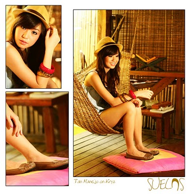
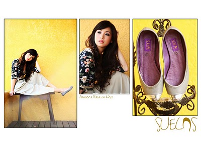
Now these are the kind of shoots I don’t mind doing ex-deal. Not if you’re getting several pairs of the comfiest ballet flats EVER.
I already got 5 pairs of Suelas, and I still can’t get enough of them. I want them in all available colors!
Check out their Facebook fan page and you’ll see that it’s actually pretty normal for a girl to have 10 pairs of Suelas. I’ve tried on lots of ballet flats since that’s what I usually use for work (since I’m always standing or walking), and so far these babies don’t hurt my feet at all unlike other pricier flats.
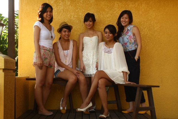
We were supposed to shoot this set at UP, so I volunteered my makeup studio as the prep place since my studio is just 10 minutes away from UP. We ended up staying and shooting at my house though, which was actually better since we did lots of layouts. Here are some of the photos:
Makeup by Kris Bacani
Styling by Jackie Tan
Models: Liana Lim and Kryz Uy
Photos by Aaron Vicencio
Aaron also did two cool videos of this shoot. Check them out here =)
Quality material + Uber comfort + Affordable price + Cute designs + Pinoy-made = SUELAS!
Christian Bautista (Cosmo Centerfolds 2010)
Posted by krisbacani in Editorial on September 22, 2010
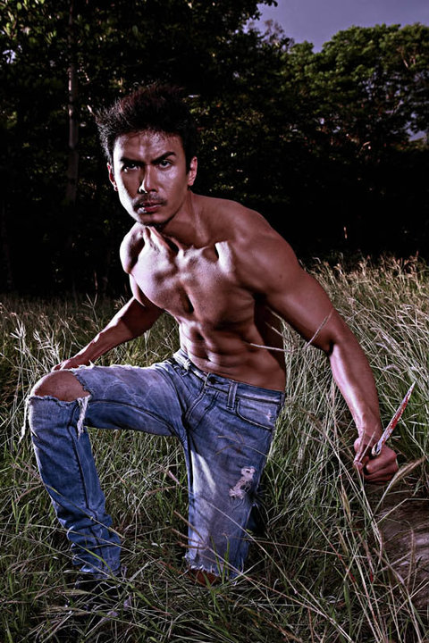
I was quite surprised that the former lean and lanky Christian Bautista now has a hot bod. Just goes to show that to survive showbiz here, having six-pack abs is now a requirement, even for singers (well, maybe with the exception of John Lloyd Cruz!)
Watching Christian work out with his personal trainer before the shoot made me want to run to the gym after and do crunches. He does work out hard!
Grooming by Kris Bacani
Styling by Sidney Yap
Photos by Heidi Pascual
Btw, because of this gig, I scored VIP tickets for the Cosmo Bachelor Bash held last Sept 9 at the World Trade Center.
I tagged along my friend Yucel so I won’t look stupid, um, unleashing my wild side by myself. =p
All I can say is, it definitely was a wild, wild, night!
Check out more photos from this event at cosmo.ph


